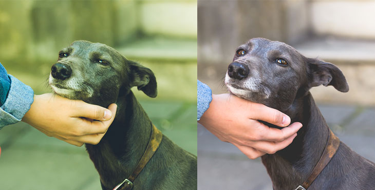
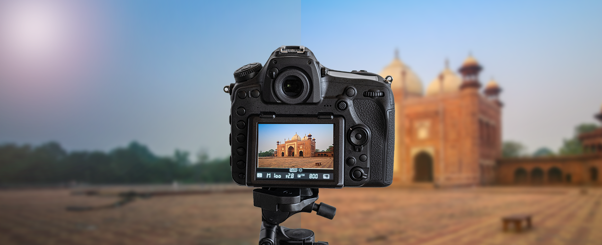
Color is physiological — it’s easier to relax in a room painted yellow than it is in one that’s painted red. Each color on the color wheel is associated with specific emotions. And while photographers can’t change the color in their work the way that a painter can, color can be easily manipulated in post-processing in more subtle ways — and manipulating those colors can drastically change the mood and feel of the image.
Split toning is one-way photographers can adjust the colors in their image, yet it’s often an underused technique because many photographers simply don’t realize that it’s there. So, what is color toning, and how is color toning used in photography? Find out how the art of split toning can create magical effects in your photographs.
What Is Split Toning
Split toning is a technique as old as film photography. Simply put, split toning allows you to color your highlights and your shadows separately. Using split toning, you add small amounts of color to the lightest or darkest areas of the image to create a certain effect.
Unlike the actual controls for highlights and shadows, split toning doesn’t affect the exposure of the image — before and after split toning, those shadows and highlights aren’t any lighter or darker. What’s changed is the color, sometimes drastically, but often subtlety to create a specific feel.
What Is Split Toning Used For
Split toning has a number of different uses — and it’s a technique that’s used across multiple genres of photography including portraits, landscape, fashion, and commercial. One, like we already discussed, is to influence the mood of an image. Colors are associated with specific emotions, and by playing with the colors in split toning, you can supplement composition and exposure and push for more of that feel you were going for with color.
Split toning is also used to mimic the color of a specific film while working with a digital file. The film often has more oranges, blues or greens than a digital file and split toning allows you to turn a neutral digital file into one that looks like it was shot with specific, classic film.
Split toning isn’t just limited to color photography either — using split toning on a monochrome image; you can create a sepia effect or add a tint of blue. Duotone looks can also be created using split toning on a black and white image.
While adjusting the white balance is simple on a RAW file, split toning also allows for more specific adjustments. Using split toning with oranges and blues, you can warm up only part of the image. This is helpful if the shot had two different types of light, as well as for applying warming or cooling effects without wrecking skin tones.
Why Use Split Toning
Split toning is one color tool that can be used along with options like white balance, hue, saturation, and luminance. So why use split toning over these other tools, when, say, HSL is also used to mimic film effects, for example?
Split toning is a simple way to adjust the color only in a portion of the image. While white balance will affect an entire image and the HSL panel will affect only specific colors, split toning will adjust only the highlights or only the shadows. Split toning doesn’t replace any of these tools and is used in conjunction, can perfect all the colors in the image.
How to Use Split Toning
The key to successful split toning is making subtle changes — like many other edits; beginners tend to overdo it, so err on the side of caution. If you are color toning a black and white image, make sure to convert to black and white first.
Lightroom has an entire panel devoted to split toning, divided into the highlights, shadows and the balance between the two. The hue slider allows you to choose the color for both the highlights and shadows separately. Another option for selecting the color is to click on the gray box above the hue slider and select the appropriate colors from the pop-up window.
Which Colors Bring Greater Effect
So what colors should you use? While blue and orange are popular because the result affects the warmth or coolness of an image, the color possibilities are endless. You can use colors that are already in the photo to further push the feel of the image through color, or you can use the colors that are most prominent in your favorite film or try something different to come up with a unique look.
Remember the Color Rules
Just make sure that the colors that you choose both works together. Try using color rules like complementary or triad to make sure your colors both work with each other and the other prominent colors in the image. Adobe Color CC is an excellent tool for finding out what colors fit without memorizing the color rules.
Don’t Overdo Saturation
Saturation is where it’s easy to overdo. Starting with the saturation slider at 0, you won’t see any color changes yet from your first selection. Gradually move the saturation slider to the right until you find the appropriate levels — then, since most beginners overdo it, move that slider back just a smidgen. Ideally, you shouldn’t notice the color toning until you see a before and after shot, because the difference is subtle, yet plays a role in the overall emotion of the image.
Finally, adjust the balance slider to either make one or the other more prominent or have a neutral balance. If you move the slider right, the highlight toning will be more obvious, while the left will exaggerate the toning for the shadows.
Split toning is a color adjustment that, while often subtle, can make a big impact on the overall feel of your image, along with using other color tools. Split toning can take some practice and fine-tuning to get right. SmartPHOTOeditors, being a decade old photo editing service provider has been assisting photographers and proto studios with similar offerings, including portrait retouching, color correction, photo restoration, etc. As a final note, color plays a vital role in the overall feel of an image — split toning can perfect that feel, create a vintage film look, or create the perfect white balance.
– SmartPHOTOeditors
SmartPHOTOeditors


