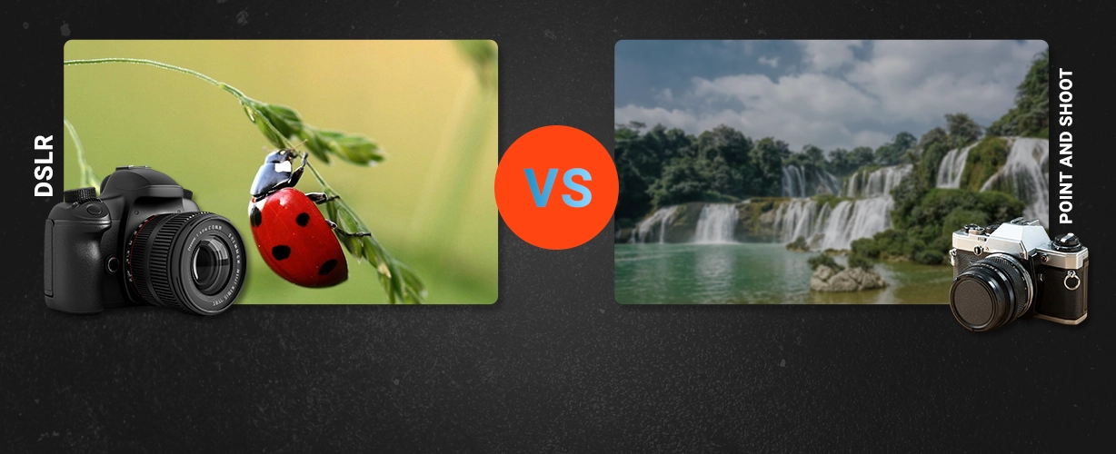
Sure, graphic designers and photographers may both use Photoshop, but they are very different mediums. Still, that doesn’t mean they don’t cross over from time to time, borrowing ideas from each other or simply drawing from the same timeless artistic inspiration. Some photography concepts, styles, and trends, in fact, borrow from the design world, applying similar concepts to the way the camera frames up the real world.
As both visual arts, photographic and graphic designs often share concepts. Sometimes, those ideas are as long withstanding as white space. Other times, those borrowed ideas trend with the latest styles, like vibrant colors. No matter where the trends and ideas come from, here are six graphic design concepts to inspire your photography.
White space
Graphic designers know that’s what’s not there is often just as important as what is. White space gives the viewer room to breathe and draws attention to where the designer needs it most. Leaving white space helps a design to feel less cluttered.

In photography, “white” space may not exactly be white, but using empty space in an image can have similar effects. Placing the subject off to one side and blurring out the background has a similar intensifying effect as using white space in document design. Eliminating unnecessary distractions as you compose the image helps leaving “white” space — even if the space is, in fact, green or another color. Leaving portions of the image empty helps create a stronger, less cluttered composition.
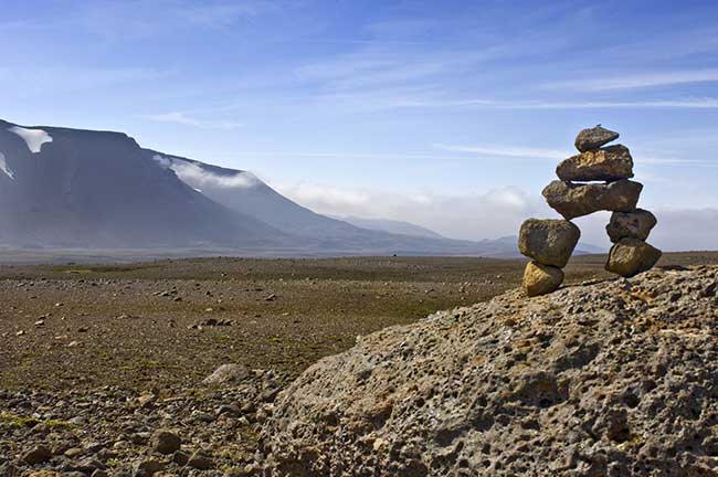
Lines
Lines are always present in the graphic design, whether they are real outlines or invisible lines that align the different elements of the design. Lines can help separate, organize, draw the eye or even help to create an overall feeling or mood.
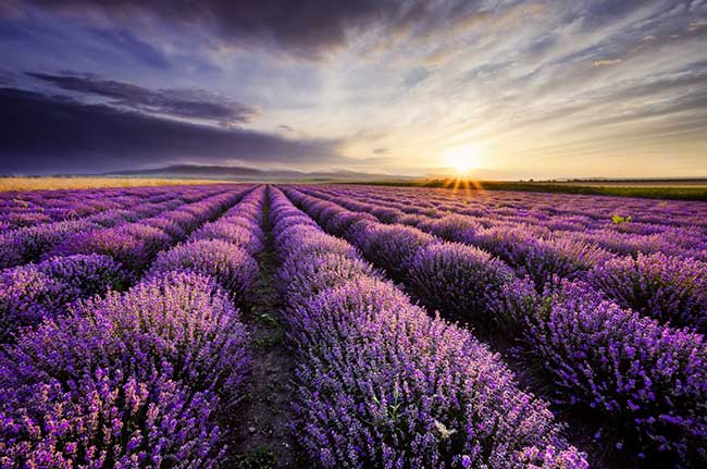
Lines in photography work much the same way, though lines in a photo are often much less obvious. The lines created by the curve of a road or a fence post, a line of trees, or even the horizon serve as a sort of design tool for photographers. Like in graphic design, lines can be actual geometric shapes in an image, or they can be implied — the direction a person is looking in a photograph, for example, often creates that invisible but implied line.
Lines can separate elements of the image or draw attention to certain areas of the frame. And like in some graphic designs, lines can even help build the overall emotion conveyed by the piece. A horizontal line feels stagnate or peaceful while vertical lines create a more alert feeling. Diagonal lines tend to show movement or add depth.
Minimalism
Elaborate designs are impressive, but sometimes it’s the simple designs that are the most eye-catching. Simple designs stand out in a busy world with hundreds, even thousands, of things vying for attention. Minimalist designs eliminate nearly everything down to the necessities.
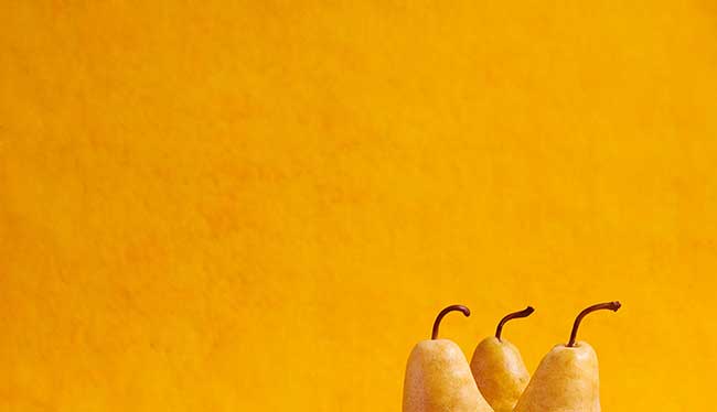
Paring down the objects in your photos can have a similar effect. The more items you remove from the composition, in general, the more attention the subject tends to draw. Even your subject can be minimal — highlighting a simple, everyday object with a photograph, even done in a minimalist style, tends to emphasize that item’s importance.
Color trends
Graphic designers can change the color in their designs to any number of millions of possibilities. Color schemes tend to drive the designs, since creating a harmonious color palette is as easy as a few clicks in Photoshop.
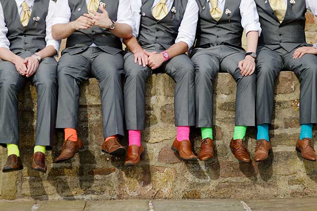
In photography, the color scheme is a bit harder to change — but can still make up a large part of the image. Adjusting the composition, changing props or even simply starting out by looking for colorful inspiration can create an image that stands out largely because of its color palette. Color schemes tend to trend in and out of style — bold, vivid colors, for example, are trending in 2017 — whether you are a designer or a photographer.
Choosing colors based on where they are on the color wheel can help create a color scheme that helps convey a certain emotion or amount of contrast.
Analogous colors are next to each other — like red and orange, purple and blue or yellow and orange. They tend to create a sort of serene feel, and since they are often found in nature (like the green grass and blue sky), they’re easy to photograph.
Complementary colors are opposites on the color wheel — like red and green or blue and yellow. They create lots of contrast but can be rather garish if you use too much. On a smaller scale, however, this type of color scheme can draw attention to the right spots in an image.
Color schemes are more than just analogous or complimentary — they can also be triadic (three colors selected from the color wheel with an even amount of space between all three) or square (like the primary colors).
Balance
Just where things play an important role in graphic design, but balancing out the graphic as a whole is important as well. When different elements are placed symmetrically, the design feels organized. A graphic can balance one large item with two smaller ones as well. Asymmetrical balance, or intentionally not aligning the objects, instead of order, creates a feeling of movement.
Balance can be inspiring for photography composition as well. Placing one larger object on one side of the image and two smaller objects on the other creates a feeling of stability and organization. If the composition is unbalanced, it can feel a bit more jarring or out of place — and sometimes that’s exactly what the photographer wants.
Texture
While both photographs and document designs are two-dimensional, using texture can create a 3D-like effect. Texture adds depth and interest. In graphic design, incorporating texture often means using photos of things full of texture — like a brick wall or an animal’s fur. In photography, using texture means seeking out subjects with lots of fine detail and shooting in a way to keep those little details intact. Those details, while captured on a two-dimensional surface, are the key to adding an almost tangible feel to an image.

Graphic design and photography share several similar concepts — asking from where each idea came from is sort of like asking whether the chicken or the egg came first. As close artistic cousins, photographers can be inspired by graphic artists, and graphic artists by photographers.
– SmartPHOTOeditors
SmartPHOTOeditors
 Prev
Prev